Creating a peaceful and inviting atmosphere in your home often starts with choosing the right colors. Calm colors can transform any room into a tranquil retreat where you can relax, recharge, and feel truly at ease. But with so many shades and tones available, how do you pick the best calm colors that suit your space and style?
In this post, we’ll explore helpful tips to guide you in selecting calm colors for your home. From understanding the basics of color psychology to practical strategies for combining hues, these insights will help you create harmonious and soothing interiors.
Why Choose Calm Colors for Your Home?
Before diving into color selection, it’s useful to know why calm colors are a popular choice:
– Promote relaxation: Soft, muted colors can reduce stress and anxiety.
– Enhance focus: Calm tones create environments conducive to concentration.
– Timeless appeal: These shades often remain stylish longer than bold trends.
– Flexibility: Calm palettes blend well with various textures and décor styles.
Knowing the benefits will make your decisions more meaningful and intentional.
Understand the Basics of Color Psychology
Colors can impact your mood and perception in subtle ways. Here are some common calm colors and their psychological effects:
– Blue: Often associated with serenity and trust, blue is a classic calming choice.
– Green: Evokes nature, freshness, and renewal—perfect for bringing a peaceful vibe.
– Lavender: A soft purple that soothes and promotes restful feelings.
– Beige and soft browns: Neutral and grounding, creating warm, cozy spaces.
– Soft gray: Elegant and modern, gray offers calm without feeling dull.
Keep in mind that the specific shade and intensity can change how the color feels. Lighter, less saturated hues typically feel more calming.
Tips to Choose Calm Colors for Different Rooms
1. Consider the Room’s Purpose
Each room in your home serves a unique function, and the color should support that:
– Bedrooms: Opt for soft blues, lavenders, or gentle greens to encourage restfulness.
– Living rooms: Warm neutrals or muted greens can create a welcoming, relaxing space.
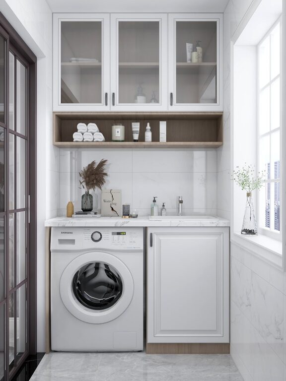
– Bathrooms: Crisp, pale blues and seafoam greens evoke cleanliness and calm.
– Home offices: Soft grays or blues help maintain focus without overpowering.
2. Test Colors in Natural and Artificial Light
Lighting affects how colors appear. Try these steps:
– Paint small patches on walls and observe them throughout the day.
– Check how the color looks under your room’s lighting fixtures.
– Remember that cooler colors may look darker or less vibrant under warm lights.
3. Use Color Samples and Swatches
Buying large paint samples or collecting fabric swatches can help you visualize how colors coordinate with furniture and flooring. This step is especially helpful if you plan to use multiple shades in one space.
4. Embrace a Monochromatic Palette
Using different shades of the same color can create a relaxing, cohesive look. For example, pairing a pale blue with deeper navy and soft gray-blue accents can feel calm without being monotonous.
5. Balance Color with Texture and Accents
Calm colors work well with varied textures like linen, wood, and soft rugs. Accent colors in subtle patterns or natural materials add depth and interest without overwhelming the peaceful palette.
Common Calm Color Mistakes to Avoid
– Choosing colors that are too dull: Very muted colors can feel lifeless if overused. Balance with brighter neutrals or textures.
– Ignoring undertones: A beige with pink undertones may not feel as calming as one with warm yellow undertones.
– Overusing white: While white can feel fresh and clean, too much may feel stark rather than calming.
– Forgetting about ceiling and trim: Including calm colors on ceilings and trim can tie the look together and prevent contrast from feeling jarring.
Easy Ways to Introduce Calm Colors Without Painting
If you’re not ready for a full paint job, there are simple ways to bring calm tones into your home:
– Add throw pillows, curtains, or rugs in soft blues, greens, or lavenders.
– Use artwork featuring your chosen calm hues.
– Incorporate plants, which naturally add green and promote calmness.
– Swap out lampshades or small furniture items for pieces in muted shades.
Final Thoughts
Choosing calm colors for your home is about creating a sanctuary that nurtures your well-being. By considering room purpose, lighting, and color psychology, and balancing your palette with texture and accents, you can design spaces that feel peaceful, timeless, and uniquely yours.
Remember, the most important factor is how the colors make you feel. Take your time exploring options, and enjoy the process of making your home a more calming place to be.
—
We hope these tips help inspire your next home color makeover. Happy decorating!